Conversations For Transformation: Essays Inspired By The Ideas Of Werner Erhard

Conversations For Transformation

Essays By Laurence Platt

Inspired By The Ideas Of Werner Erhard

And More


BREAKTHROUGH PAINTING

Carpinteria, California, USA

July 15, 2010


This essay, BREAKTHROUGH PAINTING, is the companion piece to in that order.

It is also the fourth in an undectet of Breakthroughs: It is also the prequel to Artist In Acrylics, Artist In Words.

I am indebted to Marque Bradford and to James Vicary Thackwray and to Judith Marina Haupt who inspired this conversation.


It's said there are no accidents. Yet saying the first one appeared twenty five years ago by accident is good enough for jazz.

Here's what happened.

I was making posters for a presentation. Using spatulas and stubby bristle brushes with thick, circular half inch diameter heads, I painted lettering on large sheets of bristol  card stock with colored acrylic paints. I then cut the card stock to poster size with a guillotine. In the course of the project, random splats and blobs of paint spattered on pieces of the offcut card stock laying beside the guillotine on the work table. At some point I looked over and noticed an attractive yet clearly accidental  configuration of paint on an offcut piece of bristol measuring roughly six inches by four inches.

I forgot about it ... then I looked over at it again ... then I forgot about it and continued working ... then I looked over at it again.

"Hmmm  ..." something said out of nowhere. I reached over, picked up the spattered offcut piece of bristol, turned it around, first this  way then that  way, then that  way then this  way. You've heard the expression (the caricature actually) "A light bulb turned on in my head"? Well ... a light bulb turned on in my head. I said "Wow! This  could make a great postcard.".

That's how BREAKTHROUGH PAINTING  began. That was the first BREAKTHROUGH PAINTING of the nearly three thousand two hundred and fifty handpainted originals I've painted so far since then.

I didn't name the paintings BREAKTHROUGH PAINTING at first. Indeed, at first I didn't name them at all. Then when I did name them, the name went through four different iterations in the first five years of its genesis until I alit on BREAKTHROUGH PAINTING which has stayed ever since.

In the first year they were "SKY PAINTING"  which had a contextual feel  I liked. But after a while I realized "SKY PAINTING" wasn't grounded  enough for my liking. So for the next two years they were "ZEN PAINTING"  which I liked more and which fitted  aptly. Yet after a while what didn't work for me about it is there's no patent allegiance in "ZEN PAINTING".

Let me explain the part about allegiance.

However creative I am and have been, my creativity is honed, marshaled, and is more acute since I was introduced to Werner's work. It's not that immersing myself in Werner's work changed  my creativity. It didn't. Rather what it did was unleash  it. It made possible what until then wasn't even a blip on the radar of what's possible for me creatively. I wanted to imply that in the name as an allegiance. And even though as a by-product  of participating in Werner's work I became aware of Zen and how it created the space for Werner's work to come forth in the first place, the name "ZEN PAINTING" doesn't really communicate this allegiance.

So for a while I ran with "BREAKTHROUGH ZEN PAINTING"  because for me it conveys an allegiance. The allegiance it conveys is with the spirit embodied in the Breakthrough Racing  team which created miracles on the racetracks of the USA in the late 1970s when Werner driving an Argo Super Vee  won the gold cup on the Formula Continental circuit as the laboratory  in which to research who he is as team.

Then "BREAKTHROUGH ZEN PAINTING" morphed  one final time. I was clear about the "BREAKTHROUGH" descriptor so it stayed. The "PAINTING" descriptor was a no brainer  so it also stayed. But eventually I realized the "ZEN" descriptor, although fitting, was redundant. So I discarded it leaving BREAKTHROUGH PAINTING which has stayed ever since.


Execution


Photography by Victoria Hamilton-Rivers - Muir Beach, California, USA - 10:48am Sunday May 16, 2010
Hold
Photography by Victoria Hamilton-Rivers - Muir Beach, California, USA - 10:48am Sunday May 16, 2010
Go!
BREAKTHROUGH PAINTING
I guillotine a stack of bristol card stock into six and a half inch by four inch pieces.

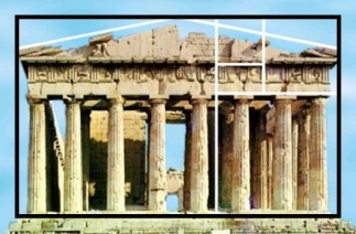
The Parthenon, Athenian Acropolis, Greece
as golden rectangle
The proportion  afforded by this shape is the golden rectangle. I lay out a neat array of tubes of acrylic paint of various colors. A kitchen plate suffices as a palette for mixing and adding water if necessary for texture (a goblet glass, also from the kitchen, is on hand filled with clean water if required for this purpose).

There's no method to what I do although you could say there's a discipline. I choose whichever colors call  me. You could say I choose whichever colors I choose. Then, either with a spatula or with a stubby brush dipped in paint with water added (or not), I make very few  minimalistic bold sweeps onto the card.

Done. That's it!  And that's all. There are no no accidents. There are no mistakes. I make no corrections. Each card ie each BREAKTHROUGH PAINTING is complete as it is. I never discard any.

I'll paint around fifty cards in one session. Each one, inspired as it is by the previous one, turns out slightly different. Occasionally in a session something completely unexpected ie something completely discontiguous  happens: suddenly I'll notice I painted in a way I've never painted before let alone thought of painting before. That's when the process takes a totally different turn all by itself.

I love  these moments. They're true spontaneity  presencing itself.

At the end of a session, I wash the brushes, spatulas, plate, and goblet glass under running tap water, dry them all carefully, then stow them along with the tubes of acrylic paint and the blank cut card stock in the canvas bag I keep them in.

When the paintings are dry I sign the front lower left of each in pencil and number them on the lower right. I draw a vertical line on the reverse dividing it into two rectangles three and a half inches wide and three inches wide. The three and a half inch side is for a communication. The three inch side is for a mailing address. Along the line on the three and a half inch side I pencil in block capital letters "BREAKTHROUGH PAINTING"; on the other side I pencil "HANDPAINTED ORIGINAL". There's no date. The date each card carries is the date of the communication written on the card and mailed, whenever that may be.


Completion

Lay your mouse on BREAKTHROUGH PAINTING #3240 to turn it over
(works best with Chrome)
BREAKTHROUGH PAINTING #3204 by Laurence Platt

Photography by Laurence Platt
BREAKTHROUGH PAINTING #3240
Actual Size

Side A
The nearly three thousand two hundred and fifty BREAKTHROUGH PAINTING handpainted originals (so far) would blanket or wallpaper a six hundred square foot area. They would completely cover two hundred people laying side by side.

Imagine two hundred people laying side by side completely covered in unique six and a half inch by four inch golden rectangle postcards each with a pertinent personal  communication on the back of a minimalistic acrylic painting which painted itself.

Imagine three thousand two hundred and fifty people each with a unique six and a half inch by four inch golden rectangle postcard with a pertinent personal communication on the back of a minimalistic acrylic painting which painted itself.

This  is BREAKTHROUGH PAINTING.


Communication Promise E-Mail | Home

© Laurence Platt - 2010 through 2022 Permission